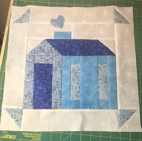
One of my goals for the week has been accomplished - the light blue "Home Is . . ." block.
As I finished this block, I was being critical about my fabric choices. Seeing it by itself I questioned whether it was too light. But next to the other 3 previous blocks it looks fine. What is my final plan for these? I have no idea yet, but I love the blocks and it will be fun to come up with something as I have more blocks. This house block is part of Pat Sloan's "Home Is . . ." online project, and she has a wonderful quilt layout designed.
The Tulip Time parts and pieces that were kitted up over the weekend are now sewn together. This is section #15 so far. These sections are about 13" unfinished. This picture is an interesting study in how poor light impacts the colors in a photograph. That upper right tulip is really a rich gold, and the lower right tulip is a much brighter aqua.
Now that the tiny little pieces of the tulips are off my sewing table, I can pull out Laundry Line again and play with those little tiny pieces. Note to self - the next project needs to have big pieces!! LOL


The blue house looks great!
ReplyDeleteWonderful blocks! I avoid projects with tiny pieces as much as I can because they are so fiddly and require so much time.
ReplyDeleteLove the blocks, especially the cute house blocks. Photographing can be a pain. I do product photos for my Etsy shop and since I'm not a photographer, I spend lots of time trying to get colors as right as possible.
ReplyDelete