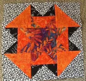
I find it so interesting that looking at a photo of a block or a quilt allows me to see things I couldn't when looking at the real thing. I knew those 2 orange blocks had too much orange, and too little contrast. But I had played with some other layouts that didn't seem to work either. But I didn't like the one block, so Sunday (while watching Jaguar/Patriots football) I took the block apart and changed it up a lot. Because I didn't have much for leftovers I had to reuse the little wings on the orange flying geese, but I used the corner orange pieces to make a new center for the geese. Much better contrast. And then I added new black corners to the white pieces. And I flipped them around so the black points out. I like this version MUCH better than the first version below.
Now the blocks don't look so much alike. And even though there is more black in the new one, it seems to emphasize the white more. The successful redo was well worth the effort, and really didn't take very long.
Check out other design walls at: http://smallquiltsanddollquilts.blogspot.com/


Beautiful!
ReplyDeleteI love it!
ReplyDeletehow graphic! The magic of color. I looked back and forth from first to second block, and the first one is much clearer star but the second one gives such a folded effect.
ReplyDeleteThe orange is awesome against black and white
I am in the learning curve also, so much difference is made when value/color placement changes on the very same block. I am always amazed. And still learning....
ReplyDelete